ONDA
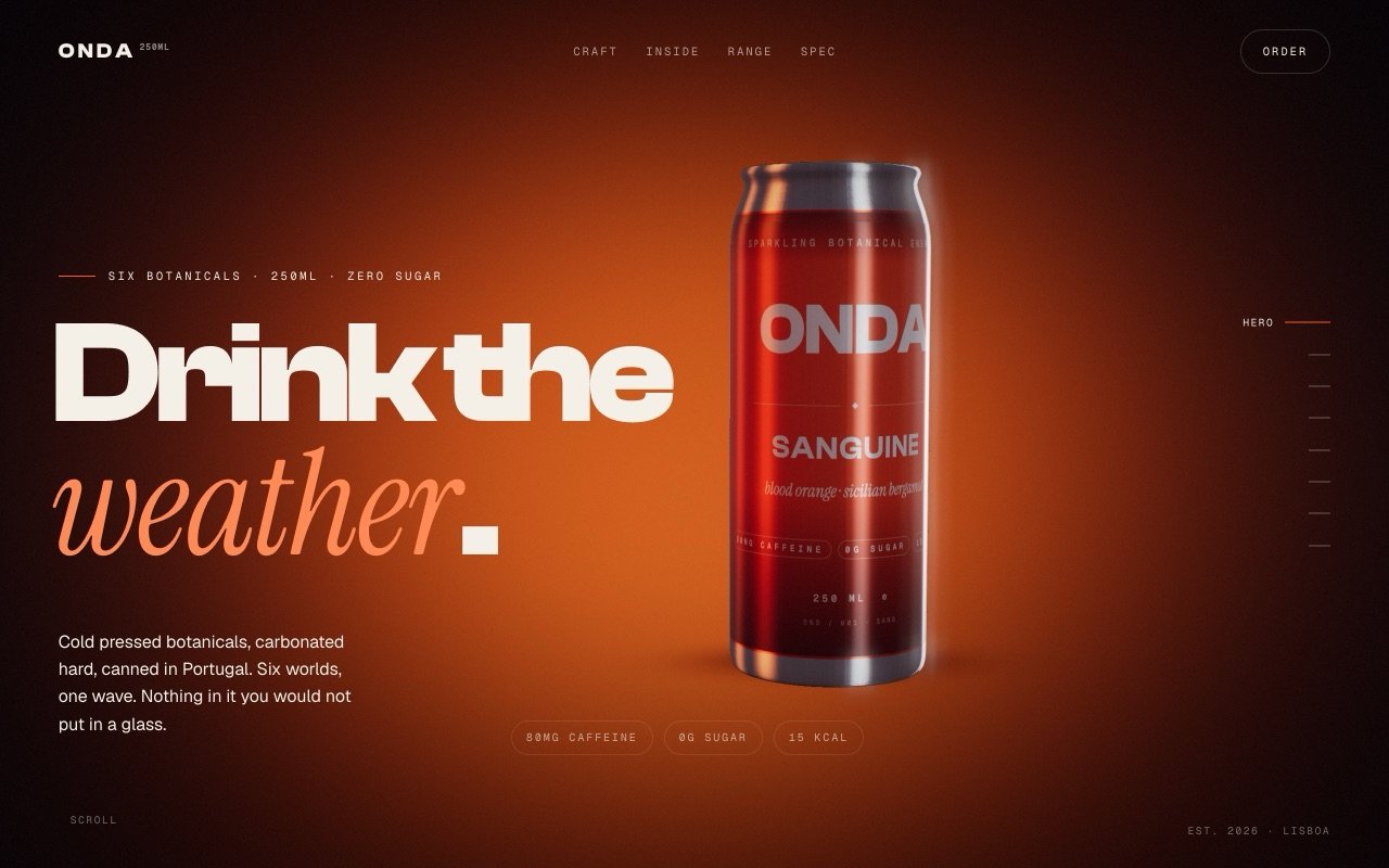
A drinks brand with six flavours and no shelf space, so the website had to do the job a shelf usually does.
3DWebGLBrand
The challenge
Drinks are chosen in the half second someone scans a fridge. ONDA had no fridge to be in. The site had to make a can you cannot pick up feel cold, heavy and worth wanting.
What we built
A scroll driven product film. The can is modelled and lit in the browser rather than photographed, it turns as you move down the page, the flavour wrap changes through the range, and halfway down it pours.
The interesting technical bit
The pour is a two pass render. The frame is drawn once without the liquid and kept, then the liquid samples that kept frame through a refracted view vector with per channel dispersion, so the label behind the stream bends the way real glass bends it.
6flavours in one live scene
121frames per second on a laptop
0stock photos used
ARUNA
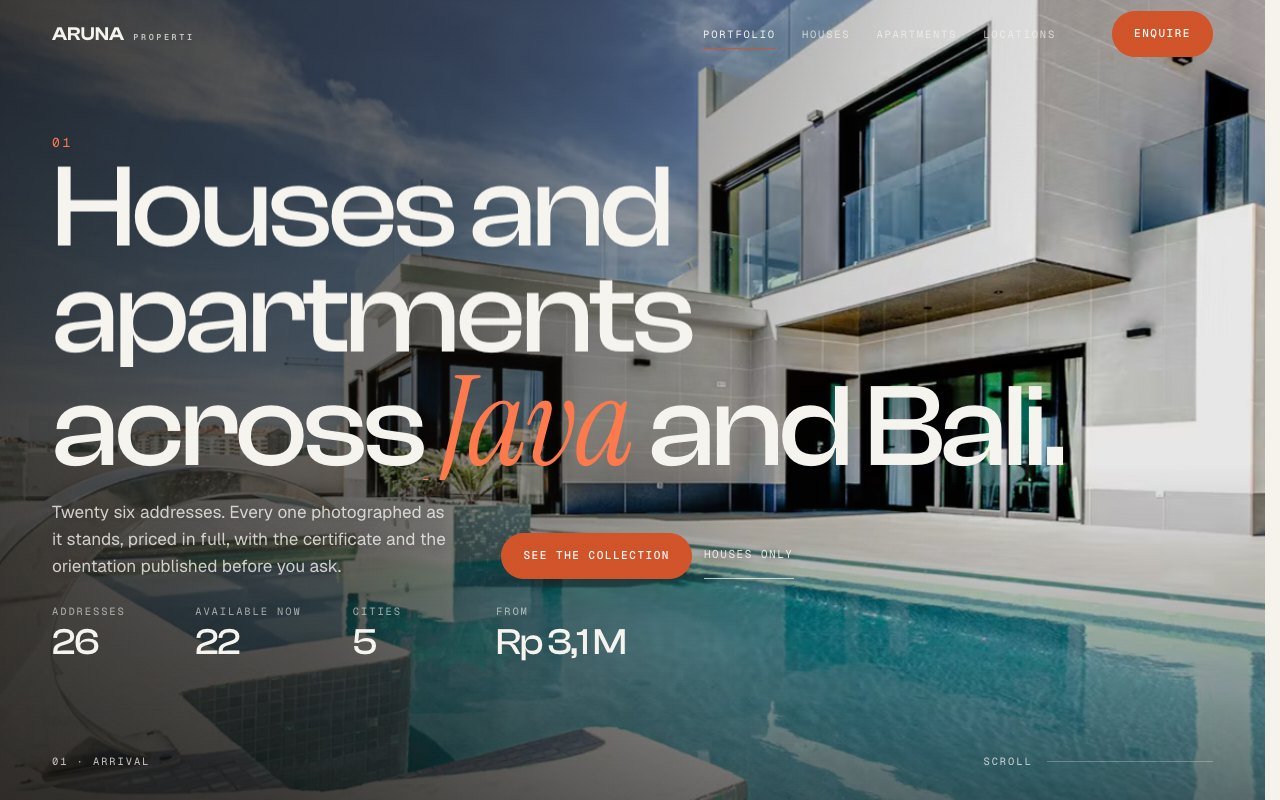
A property brand with twenty six addresses and no showroom, so the website had to be the showroom.
3DWebGLBrand
The challenge
The first version put a literal 3D villa on the homepage and it looked wrong. One named house for sale can be literal. A brand with a whole portfolio cannot, because the moment a model is recognisable every buyer compares it to a real building, and it loses.
What we built
Three pages sharing one inventory of twenty six listings. The homepage is a scroll film, houses and apartments are product grids with real photography and instant filtering. The only 3D left is an abstract white study model, which has no referent so it cannot fall into the uncanny valley.
The interesting technical bit
The homepage is one pinned stage with seven layered acts, not seven sticky sections. Sticky sections leave a handover gap where the outgoing act has scrolled away and the incoming one has not arrived: we measured 36 of 261 frames with nothing on screen, then rebuilt it as a single stage and got to zero.
26addresses in one inventory
7acts on a single pinned stage
0dead frames across the scroll
NOEMA
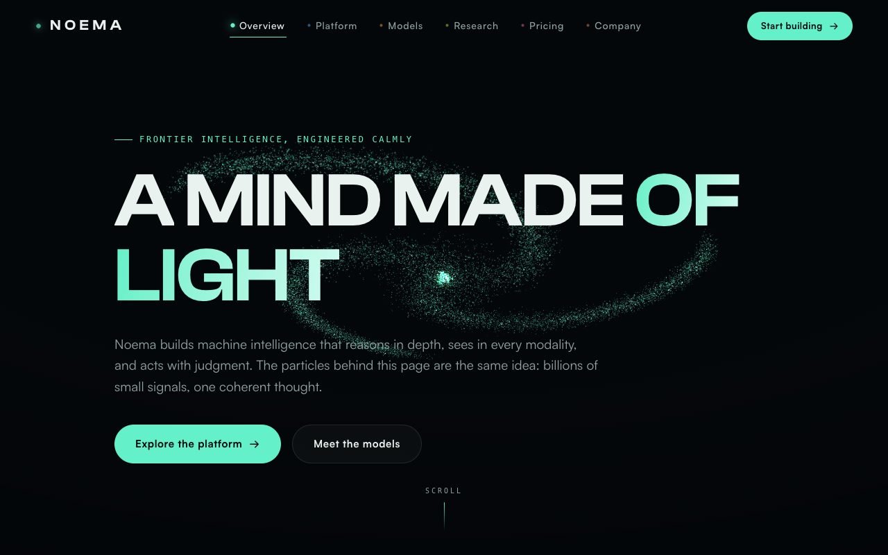
An AI research lab with nothing to demo yet, and a website that had to make the science feel inevitable instead of theoretical.
3DWebGLBrand
The challenge
They had papers, a team and no product. Every competitor site looked like a slide deck with a gradient. The lab needed a site that felt like a machine thinking, so that a first time visitor believed the work before reading a word of it.
What we built
Six pages held together by one idea. A single field of 24,000 particles acts as the lab's mind and morphs into a different shape on every page: a brain, a lattice, a signal, a sphere. The shape is handed from page to page through session storage, so the transition never resets to zero.
The interesting technical bit
The particle positions live in a texture on the GPU, so morphing between two shapes is one shader interpolation rather than 24,000 updates on the main thread. That is why it holds a steady frame rate on a five year old laptop instead of melting it.
24,000GPU particles
6pages, one continuous scene
15 / 15end to end tests passing
VOLT VAULT
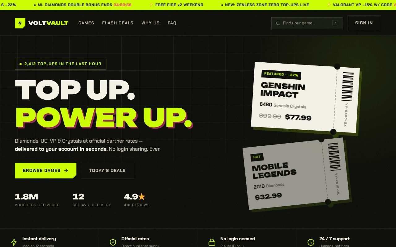
A gaming voucher shop that wanted checkout to feel like tearing a ticket at a venue, not filling in a spreadsheet.
E-commerceUI
The challenge
Voucher storefronts all look the same: a table of codes and a price column. Their customers are teenagers buying game credit at midnight, and the old site made that feel like paying a utility bill.
What we built
A storefront where every product is a perforated ticket you can almost hear rip. Live search, a running balance rail, denominations that recolour the ticket, and a three tap checkout that ends in a formatted WhatsApp order.
The interesting technical bit
The ticket notch is a single CSS mask, not an image. That means it recolours per denomination, stays razor sharp at any size and adds nothing to the download. The whole interface chrome ships without one bitmap.
3taps to checkout
42products, one layout
0images in the UI chrome
KERNEL & CO.
An infrastructure consultancy that kept losing bids to louder agencies while quietly doing the harder work.
3DCorporate
The challenge
Their proposals were excellent and their website looked like a 2014 WordPress theme. Procurement teams were scoring them down before the first call, purely on presentation.
What we built
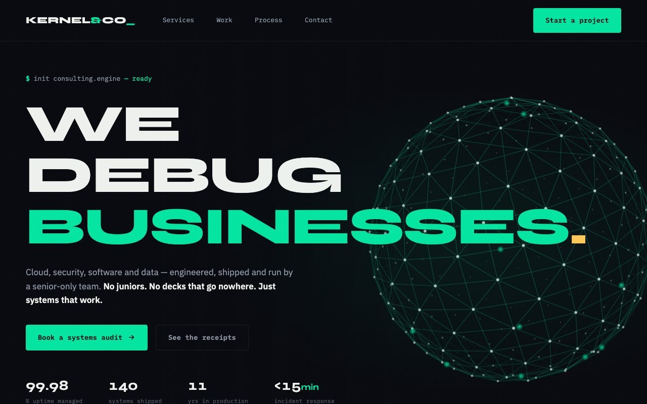
Terminal meets boardroom. Serious editorial typography, service pages written like engineering notes, a contact form that types itself out in a live terminal, and a rotating globe marking every region they operate in.
The interesting technical bit
The globe is about 150 lines of plain canvas with zero 3D libraries. Points are projected and depth sorted by hand each frame. That is why the entire page weighs less than one stock photo and still runs on a client's locked down office laptop.
150lines for the whole globe
03D libraries loaded
400 KBtotal page weight
PAWLOVE
An Indonesian pet boutique selling from chat screenshots, losing real orders inside a direct message backlog.
E-commerce3D
The challenge
Every sale started as a message asking for the price, then the size, then the colour, then a photo. The owner was answering the same four questions forty times a day and still missing orders.
What we built
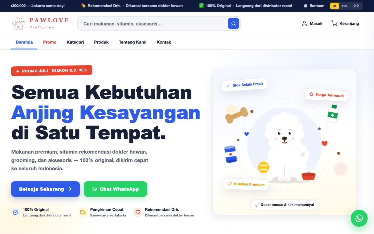
A shop with a 3D puppy in the hero that chases a ball you drag around, a proper cart with sizes and colours, and a checkout that hands a fully formatted order straight into WhatsApp.
The interesting technical bit
The dog is one model with a two bone look at rig, and the ball is thirty lines of plain physics. The important part is duller: the cart writes a structured order summary, so the owner never has to ask which size again.
4questions removed from every sale
3languages ready at launch
1tap from cart to WhatsApp
KAWAN
A Bandung roaster with twelve years of history and a website that only sold bags, so the history was doing nothing.
E-commerceBrand
The challenge
Every specialty roaster says the same three things: direct trade, small batch, roasted fresh. Kawan had something the others did not, which was twelve years of receipts, and it was buried on an about page nobody opened.
What we built
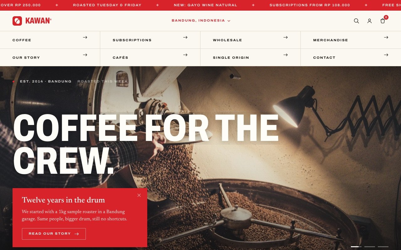
A printed catalogue rendered in a browser: bone paper, hairline rules, a boxed nav that fills red on hover. The homepage centrepiece is the history, laid out as a rail you travel sideways from 2014 to 2026 while the page holds still.
The interesting technical bit
No product photography exists, so the eight coffee bags are drawn: a kraft gradient body, a crimped top, a coloured label per blend, a specular sweep on hover and a cast shadow that shifts as the bag lifts. They stay perfectly consistent because nothing was ever shot.
7milestones on the history rail
14products drawn, not photographed
0dropped frames over 900
PUSAKA
A green coffee exporter selling to buyers in thirty eight countries who will never visit the warehouse, and had to trust it anyway.
BrandCorporate
The challenge
A roaster in Rotterdam buying a container of Sumatra is spending real money on coffee they cannot taste yet. Nice photography does not close that. Numbers do: altitude, screen size, moisture, defect count, cupping score, and where the lot actually came from.
What we built
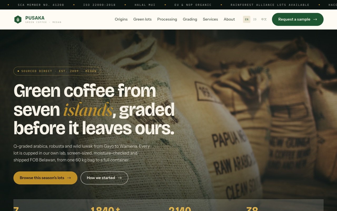
An export house rather than a shop. Spec tables everywhere, a lot list you filter by grade, four processing methods explained properly, and a live map of the archipelago where every sourcing station opens its own record.
The interesting technical bit
The map is not a picture. Twelve island outlines are projected from public domain survey geometry down to three kilobytes of inline path, and the seven stations are placed from their real coordinates, so a pin lands on the island it belongs to instead of somewhere that looks about right.
7origins plotted from real coordinates
3kilobytes for the whole map
42automated checks on every build
LUMBUNG
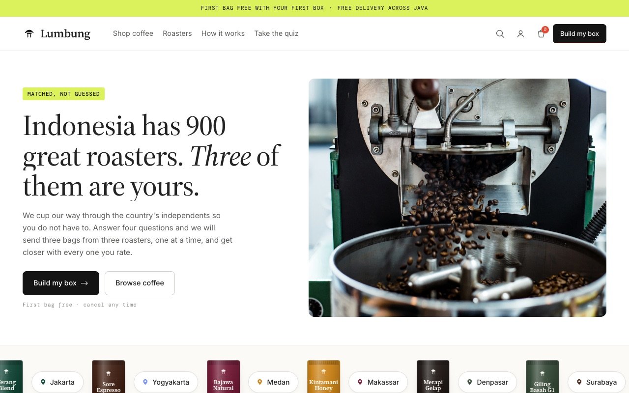
A subscription whose whole promise is that it knows what you like, so the quiz could not be decoration.
E-commerceBrand
The challenge
Most matching quizzes are a lead form wearing a costume: four questions, an email wall, and the same three products for everybody. Anyone who has taken one can feel it, and the trust never comes back.
What we built
A four question matcher that runs on the page with no email wall, returns three bags from three different roasters, and tells you in a sentence why each one was chosen. Change an answer and the box genuinely changes.
The interesting technical bit
The percentage and the explanation come from the same calculation. Brew method, milk, flavour family and volume each carry a weight, and the sentence is assembled from whichever of those actually scored, so a card can never claim a reason it was not given points for.
4questions, no email wall
3roasters guaranteed per box
43automated checks on every build
ASTER
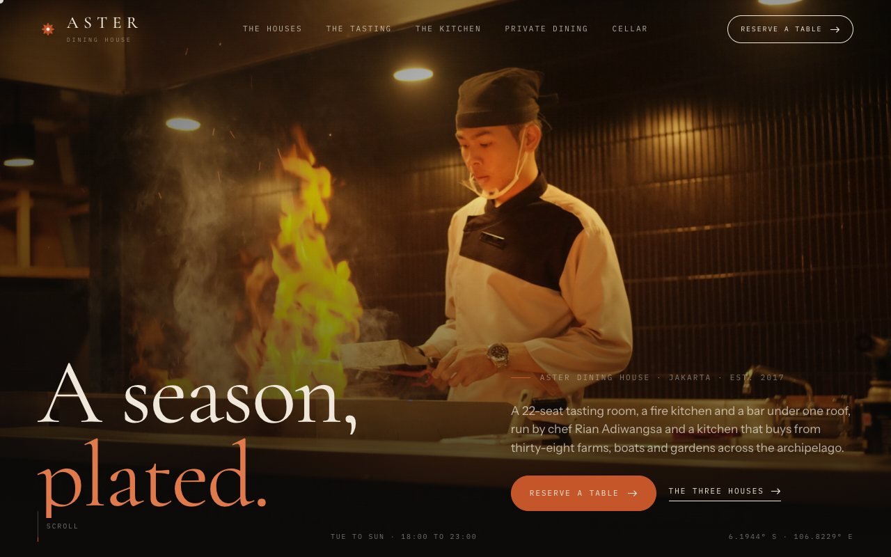
A chef with three rooms and a website that read like a hotel brochure, so nobody could tell the rooms apart.
Brand
The challenge
Fine-dining sites all reach for the same black background, gold serif and slideshow of plates. They look expensive and say nothing: which room, which night, what is actually on the menu this week.
What we built
One dining house with three doors. A pinned seven-course tasting rail where the number flips and the plate wipes in as you scroll, a hover-driven portfolio of the three rooms, private dining on an inverted bone surface, and a reservation checker that answers with a hold reference instead of a contact form.
The interesting technical bit
The rail is one sticky viewport driven by scroll progress, so it runs backwards as cleanly as forwards: the image wipes from the direction you came, the number slides the same way, and the pairing line follows the course. Availability is a deterministic hash of house, date, time and party size, so the same request always gets the same answer and the closed-on-Monday rule is enforced in code.
7courses on one pinned rail
46automated checks on every build
8.3ms median frame time
RASCAL
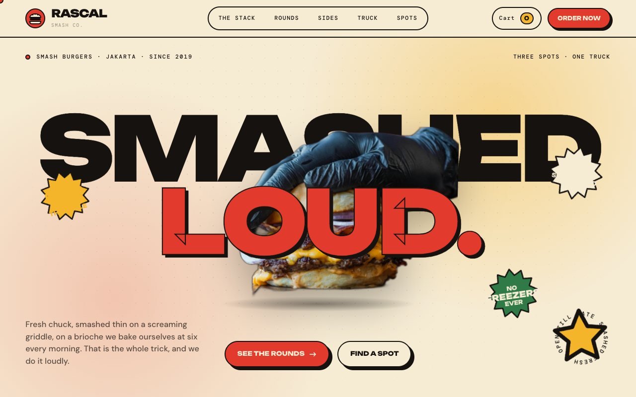
A burger brand with a loud personality and a website that had been quietly templated, so the food did all the talking and the site did none.
E-commerceBrand
The challenge
Every burger site is a full-bleed photo with a headline on top and a link to a delivery app. Ours had to feel like the brand's own voice, sell without a delivery app, and still load fast on a phone in a queue.
What we built
A cut-out hero burger that drops in with a bounce and sits between the two headline lines, an eight-layer drawn burger that assembles as you scroll, six numbered rounds on a drag rail with a cart that actually counts, a food-truck quote calculator, and location cards that check the clock to say open or closed.
The interesting technical bit
The hero burger is a real photograph cut out locally, served as a 146 KB WebP with alpha and sandwiched between two lines of type using nothing but stacking order. The stack section is one scrubbed timeline: each SVG layer falls from above with a back-out ease, the step list lights as its layer lands, and the whole burger squashes at the end.
8layers stacked by scroll
6rounds on the drag rail
41automated checks on every build
TERAS
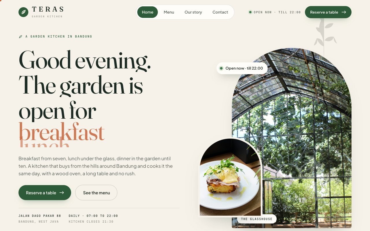
A nursery that became a restaurant and needed a website that could take a booking without a phone call.
Brand
The challenge
Restaurant sites either hide the menu in a PDF or hide the booking behind a third-party widget that looks like someone else's product. Both lose the guest at the exact moment they were ready to come.
What we built
Four pages that read like one place: a daylight home page whose greeting and open-now badge follow the clock, a full menu of thirty-six priced dishes rendered from one data file with live filters and a sticky section rail, a story page, and a contact page with a real month calendar, time slots by service, seating choice and an instant answer with a reference code.
The interesting technical bit
The menu is data. Both pages render from the same file, so a price changes once and the home page highlights, the menu rows, the filter counts and the print version all agree. The calendar is drawn from the real date: past days disabled, today marked, two months ahead, and the availability answer is a deterministic hash of date, time, party and room so the same request always gets the same reply.
36priced dishes from one data file
4pages, one design system
70automated checks on every build